Color Block Basement
ALBANY, CALIFORNIA
BOLD COLORS AND VINTAGE MID-CENTURY FURNISHINGS BRING JOY TO THIS FORMERLY GLOOMY BASEMENT
I’d already been working with my client, Josie, at this property for months before we finally kicked off this garage to ADU conversion. Like so many of my clients, Josie and her husband found themselves in the “empty nester” phase of life and started thinking about how they wanted their home to best function for them in retirement. Bedrooms in the main house were being converted into lounge and craft spaces, so what they really needed was a place to comfortably host guests from out of town.
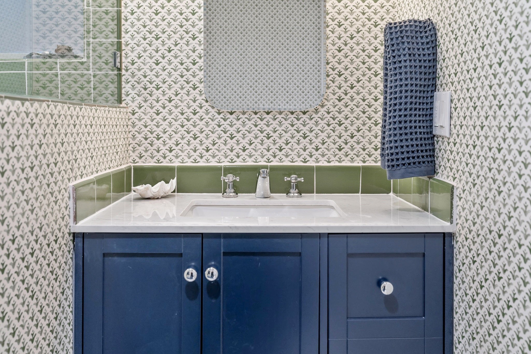
What Josie envisioned was an unapologetically bright, colorful, and whimsical space that would feel luxurious in spite of the smaller footprint. Their basement was truly unfinished and needed a lot of work, so a big part of the planning phase was spent figuring out how to make use of existing beams and retaining walls. On the kitchen and bathroom side, we made the decision to build out a pony wall so all the cabinetry could be flush with the wall. On the living and bedroom side, we wrapped and drywalled the retaining wall so it could be used as open shelving. Luckily, Josie already had acquired a lot of furniture she wasn’t using in the main house, so we were able to direct our energy to identifying the right finishing materials. We splurged on the most jaw-dropping handmade tile from Fireclay Tile for the kitchen backsplash, shower walls, and Jotul stove surround. Semihandmade delivered pre-fab cabinets and we opted for a dramatic black quartz stone for the countertop. Green and blue are Josie’s two favorite colors, so we paid homage to that in the bathroom and added some playful wallpaper and classic Carrara marble tile and countertops for a timeless look.
Bright red in spaces has proven to have negative effects on the brain, so I make a point to rarely use red in my designs, unless it’s a deep burgundy or pastel pink. I 100% broke that rule in the bedroom because I fell so in love with this Schoolhouse quilt. Sometimes, you just gotta break the rules! Especially when the client’s artwork looked so perfect combined with this bedding. Perhaps my favorite area of the ADU, and potentially the design I’m proudest of, is the Jotul stove nook that almost looks like an art installation. The H-shaped carbon tiles from Fireclay beautifully frames out the stove. Josie already had these black iron bird sculptures, so I recommended we hang them on the wall instead of distracting with colorful wall art. The space is such a mish-mosh of colors, textures, and materials – bold touches that you normally don’t see in my designs, but that I couldn’t be happier with.
“‘FABULOUS THOUGHT PARTNER’ BARELY BEGINS TO DESCRIBE THIS TALENTED, ENERGETIC, AND EFFICIENT DESIGN PROFESSIONAL!”
Catherine is simply fantastic – an excellent listener who is amazingly quick and astute at figuring out what we want as clients. She has a keen eye that can magically envision transforming any space. And she is incredible at sourcing anything and everything. When I met Catherine, I was hoping to find a thought partner to help me with a neglected room I had begun to renovate. Catherine deftly helped me complete the job, resulting in a comfortable, stylish, and fun space to retreat to and to entertain close friends. Whenever someone walks into our Sputnik lounge for the first time, an outpouring of compliments – and even wonder – follows. “Fabulous thought partner” barely begins to describe this talented, energetic, and efficient design professional! Working with Catherine has been a dream come true, and now nearly every room in our home has benefited from her touch. We could not be happier with how our nearly 100-year-old house has been updated for us to enjoy and share with family and friends. Thank you, Catherine, for making such a difference in our lives!
- Josie


